At the end of last year I was playing quite a bit with the idea of refining my wardrobe, and I started exploring the concepts in the Wardrobe Architect Series. Although turning my plans into reality has been somewhat delayed, I think it is sort of a good thing because I have been able to read and digest several books relating to the subject. I have found them to be quite helpful, and want to use many of the ideas presented to be a bit more focused in creating a more cohesive wardrobe. Additionally, I recently started watching the Craftsy course Sew to Flatter: Plan Your Best Wardrobe. The first segment of the course focuses on deciding which colors are most flattering to you. While the concepts discussed are very helpful (cool vs. warm, temperature, value, intensity, etc.) I was a bit disappointed that the conclusion of the segment was that a person should pay a professional to come up with a color swatch that they can use to pick fabrics. Of course, in the next segment you get to see the power of having a color swatch book (and now I really want one!), but, again, I was stuck back at the mystery step of how to create one?
So, of course, because I’d rather spend $350 on fabrics thank you very much, I went searching around the internet and found this very cool tutorial on Seamwork. I also found a really helpful blog post where the author of Free Notion tried this method and documented it. Seemed pretty legit, and using the free Adobe CC tool was way cheaper than $350, so I was in!
The first step was to take a photo in natural light. I took two – one in warmer light and one in cooler light, both outside, both sans makeup. I uploaded the images to the Adobe CC by clicking on the camera icon on the right. Then, dragging and dropping the selection tools, I was able to get a 5-color palette that represented my root, hair, eyes, skin, and lips. You can see how important lighting is to get an accurate color representation:
Using Gimp (again, FREE!), I was able to identify the hex code for my 5 colors. Taking that code, I was able to use the Adobe CC color wheel to create a 24-color palette for each of my images.
Here is an example of what the palettes look like using the same base color (from my eyes) to get different combinations:
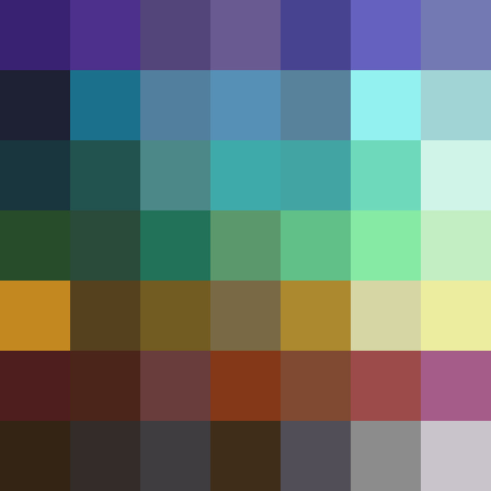
And here is the palette I ended up with after combing everything in Gimp:

Honestly, these colors look, on the whole, really together and really good next to my face! It seems like a much more successful attempt at creating a starting palette than picking 20 colors based on what I like as I had done with the original Wardrobe Architect method. I spent some time paring this down to my favorite colors from this palette, at least as far as wanting to wear clothing goes.

I’m also aware that the variety of browns, pinks, and purples in the original will be great for picking out makeup colors too! I’m definitely going to use this as a reference when buying things online. (Speaking of, in accordance with the spirit of a wardrobe overhaul, I’ve recently been spending time doing something of a makeup overhaul. There is a lot to discuss with this one, but I’ll probably do a post once I have a better feel for the products I have bought and decide how exactly I feel about them.)
Anyway, a few things I’ve noticed…
(1) I always assumed I was a “winter” (cool/dark coloring) based on online quizzes and muddled self-assessment, but a lot of the colors in this personal palette are a lot richer and deeper than the traditional winter color palettes you see on various websites, yet also much less orange/red than the typical “autumn” shades. I’m definitely a convert to Nancy Nix-Rice’s (teacher of the Craftsy class) view that lumping people into four (or twelve or thirty-six) color groups is impractical.
(2) I’m still 95% sure I’ve got cool undertones – I look better in silver, my veins are purple, and whenever I wear really warmly toned makeup I look like a clown. Which again is weird because I seem to have generated a warm palette, so I’ll have to see what color combos I can get out of this.
(3) I have way more green and purple in my palette than I thought! I mean, in hindsight, of course it is going to look good in a triad colorway with my hair coloring, but I just never really thought about it before. Makes sense why I was so enamored with my Wicked inspired bridal shower dress too. And I definitely need to start wearing more purple around my eyes.
(4) Nancy Nix-Rice is really set against black and white, but I still think I look good in black. I keep trying it against my skin. I still like it.
(5) The condensed color palette is going to be really helpful in creating a much smaller capsule color palette, because I have so many coordinating colors to start from. I’ve been playing with ideas of things that I might want to work on in the coming months, and being able to create focused color palette will definitely be helpful when I get around to working on those plans.
(6) I’ve fallen down the rabbit hole of using my palette colors to find other coordinating colors, because I really want need more blue in my life. I think I’ve found some good coordinating shades, which I’ve saved in my giant color inspiration folder for later. But I really need to stop, because I’ve still got sewing to get finished for nationals.
Finally, a question! Have any of you made your own personal color palettes? How did you do it? What is your opinion on getting a professional color consultation? Would it impact how you buy fabrics? Do you have an intuitive, innate sense of what looks good on you? Or do you find yourself sewing colors that turn into wadders because the garment just doesn’t look good on you? Feel free to discuss experiences and thoughts on color palettes and color theory in the comments!


Very interesting approach! I might try this out to see what happens. Looks like overall, your palette is mostly warm based… you might also be able to choose colors that are basically warm and have them coordinate? I don’t know, this is really unfamiliar to me as a way to choose fabrics, but it is very intriguing…! Can’t wait to see what you come up with in sewing.
LikeLike
The talk of colors and seasons and the like always fascinates me. There always seem to be one setting for “dark” skin. So I read with interest but never try to apply the “rules”…I just wear a bit of everything except red. Well, I wear red on my lower half. I think I look good in purple but rarely wear it. And I don’t dislike wearing brown but I’m brown and I’m not into looking like a walking bar of chocolate!
But black, white, grey, all shades of cream/off white/beige/camel/caramel/tan, ALL THE BLUES!!, orange, yellows, greens…I think I can wear most pinks but only like bright/deep pinks.
I need a magic way to choose prints!
LikeLiked by 1 person
I’ve always found the single setting for darker skin tones in the seasonal approach to be odd. I think there is just as much (if not more) nuance and variability in the darker skin tones than lighter ones, so it would stand to reason that there should be more variability in the “optimal” color palette as well. Interestingly, I think the simplest and best explanation I found was in one a YouTube video by Justine Leconte (https://www.youtube.com/watch?v=lbwgkaa3SFY), who has a whole series on colors for fashion (https://www.youtube.com/playlist?list=PL9e2viG3AuRMdUdYkTZSoT5DWWbHNwJ8K). Basically, the goal is to find harmonious contrast. She also uses an app similar to the Adobe CC to determine which color is predominant in her skin tone, then discusses which colors will look good because of that. On the whole it is a really interesting discussion, and not limited in the way that the seasonal approach it. Her video on undertones is also really informative – the color video helps you narrow down options on the color wheel, and the second helps you pick shades based on your undertones.
As far as picking prints goes, I think the best example I saw was in the Craftsy class. She creates a color swatch card for various people, then holds this next to several prints. The colors don’t have to be an exact match – they just have to generally go together – to know the print (or even solid) will basically work for that person. Scale and body shape were also important things that she discussed and considered for her models.
LikeLike
Interesting! It’s very surprising that the method produced so many warm colours. Although my hairdresser, who has a great eye, reckons warm vs cool is overrated, at least as a way to pick hair colour.
I’m going in the opposite direction right now. Everything I make is black or grey because I know I’ll wear it.
LikeLike
Yeah, I *always* tend towards cooler colors, and I *know* warmer colors wash me out. The funny thing is when I picked out my favorites, they all tended towards the cooler end of the range. The oddest thing to me is still how much everyone says to avoid black, because I’m right there with you on the blacks and grays – I’ll wear those as coordinating colors with everything!
LikeLiked by 1 person
After repeatedly finding that colour combos I love don’t look good on me, and not feeling the season colouring system worked in looked into Carol Tuttle’s system of choosing colours and styles based on your personality. Bingo! It makes such a lot of sense and has been a great help to me.
LikeLiked by 1 person
*I* looked into Carol Tuttle’s system…
LikeLike
Cool! I’ll look into that too, thanks!
LikeLike
Loving this series! I used the same Adobe CC tool to work out my colours too. I photographed myself in my favourite tops discovered that I am best in shades of blue and plum shades of red. Now working on my fabric stash.
LikeLiked by 1 person
In the 80s, Color Me Beautiful (bought at a yard sale) changed my life. Overnight I got rid of all my brown and navy accessories (just in time..I was starting to get panicky about how many shoes adulting seemed to require) and have stuck with black ever since. I still think Winter is right for me, simplistic as that system might be.
This is even more important as I’m learning to sew. I made a top from pink and tomato fabrics…both almost my colours but not quite, and when it was done it sucked the colour out of my face. It read as coral, not my colour. A couple of days later I made an infinity scarf from a black, white, turquoise and kelly green print and it lights up my face.
LikeLiked by 1 person
Interesting approach! I’m very similar coloring to you and am a shaded soft summer. One thing to keep in mind is the color itself vs how intense or muted it is. The same color can look good or not quite right on me depending how intense it is. That may be lost just going on the digital color code if it only describes hue.
LikeLiked by 1 person