The next step in the Wardrobe Architect is planning color palettes. I’m pretty sure that I didn’t quite grab the exact colors I was going for, but I’m also pretty sure that I’ve gotten fairly close.
For Week 5, I was just supposed to find a bunch of colors I like. Should have been easy, but it was a bit challenging and I ended up spending a fair amount of time staring at a hex code chart to figure out how to get the colors I wanted.

It felt a bit odd, because I kept comparing my choices to the sample version on the WA page, but I also kept realizing that I just like way more saturated colors than the example. I also noticed that my colors tend towards the ensembles of my favorite Disney characters (Esmeralda, Megara, and Elsa). Coincidence? Probably not.
For the Week 6 exercises, the palette gets split up into several categories:

The neutrals for me are pretty much blacks and greys. The top row is colors I wear a lot of now. The bottom are colors I’d like to incorporate more.
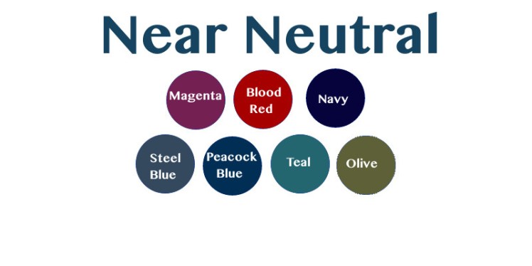
According to the website, these are colors that are “like neutrals” in that they mix with most things. These ended up being very saturated, but also subdued colors. I don’t wear a lot of olive, but I’d like to do so. I also need more navy and red in my wardrobe because I really like wearing these colors.
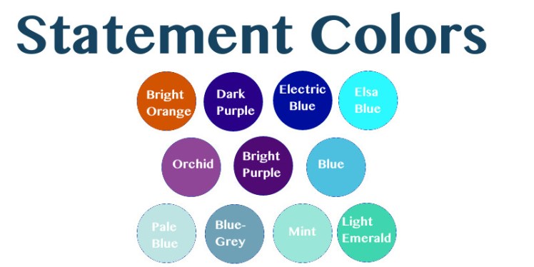
Statement colors are supposed to be the fun colors you incorporate more sparingly. These colors look a bit odd together, but I think when viewed as part of the larger palette, they incorporate pretty well.
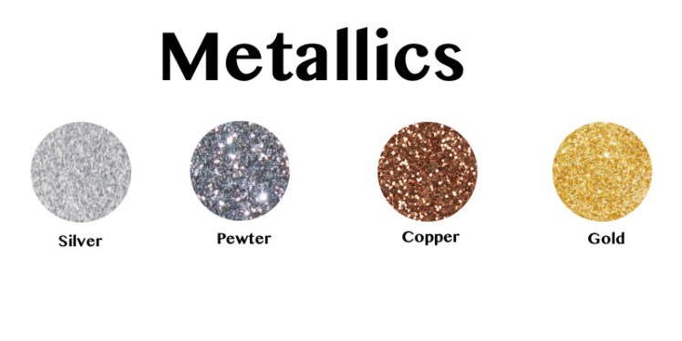
The metallics were supposed to be tending towards the cooler or warmer end, but I am indiscriminate when it comes to shiny things. I really like copper for shoes and bags, and pewter for the limited jewelry I end up wearing. Also, I’ve got some lovely pieces from Badali Jewelry in several colors and I wouldn’t want to cut any of them out. On top of that, I’m typically allergic to silver and nickel containing items, so I usually wear gold, even though I visually prefer silver things. So, all the shiny things, I will wear them.
Not much else to add at this point. I guess I’ve discovered I like saturated colors, but I think I sort of already knew that. And I like cooler colors on the spectrum. Also not a surprise. And I want to dress in the color scheme of Disney characters. I guess this sort of means I’m pretty self aware in the color category?
Up next: prints, and solids, and stripes, oh my!

This is the fun part!! I’ve never done it (and now I may do it!) I love all of the true neutrals and metallics. ALL!! All of them. 🙂
And I reacted quite strongly (surprisingly to me) to the very cool / icy blues. So I guess I’m more of warm color wearer! I also feel like I “should” like wearing true red but I just don’t. But that’s okay right?? I’m wearing more of a wine color today and love it.
And Olive. Mmmmmmmm. ADORE.
LikeLike
Notice how there is NO yellow on here? Pretty sure it’s ok if you don’t like red. I’m sure everyone’s got a color they don’t particularly like to wear. And red is tricky – it can get overwhelming. I love the super deep reds. Like, the really red-reds. Sort of the bluer-reds I guess. They can get too orange pretty quick. And wine is a really pretty color.
LikeLike
Oooh I do see no yellow now! Missed that!!
And I am fascinated by how quickly the tone of a color changes your perception of it! Speaking of the reds makes me think about pink and how it can just be SO right or SOOOOOO wrong!
LikeLike
I know! I’m not a huge fan of wearing pink, though I’m pretty sure magenta looks pretty good on me. But if given the option I always go for a different color, so I don’t have too much that is pink either.
LikeLike