After my epically long previous post on my foray into style typing, you’d think I wouldn’t have much to add. But it’s me, so, it turns out my obsession was as yet unfulfilled and I found even more to discuss. Yet again this will be quite a lengthy post full of links, though many more pictures than last time (yay pictures!). You might want to grab a fresh tea though.
As a quick recap of my last post, there are several body/style typing systems based on classifying features as being more feminine or more masculine, and playing with style lines to compliment these features. Some of the style typing gurus include colors in their types (Dressing Your Truth, Kibbe), while others prefer the 12-season method (Truth is Beauty), or argue that color is totally individual and can’t be sub-categorized (Nancy Nix-Rice). Of these systems, I had of course read about the seasons on the internet, but these typing systems always felt a bit too confined unless you were some sort of blonde. I felt like I had a vague sense of what looked good on me, which was ok enough to get me through most wardrobe choices. However, watching Nancy Nix-Rice’s Craftsy class was the first time I really saw the power of having a color fan to create a cohesive color story in a wardrobe. It’s the same idea as coming up with a color palette for a capsule wardrobe, only it encompasses many more color options. I’m a tactile person, so having tangible color cards to play with seemed like a great way to come up with colors to use in a capsule, and having a fan of pre-coordinated colors seemed like a great way to simplify the color selection process. In some sense, this entire rambling post is really the journey of me attempting to get myself a color fan. A bit ridiculous perhaps, but if I’m being honest that’s the motivating factor.
Anyway, I previously documented my attempt at creating a custom color palette based on the tutorial from Seamwork, which was also documented by Free Notion and The Curvy Sewing Collective. While I was able to generate a palette that felt much better than the random assortment of colors I’d chosen in my first attempt at following the Wardrobe Architect series, it still surprised me at how warm a lot of the colors turned out to be, and how there weren’t as many bright/cool colors as I’d expected. I liked what I’d found (I mean, it still had teal and purple, so life was going to be ok), but it still didn’t feel completely right, and the longer I looked at it, the less appealing it seemed.

This, of course, combined with the style typing research I’d been doing, resulted in me doing a bit of homework on the relationship of colors and how they can impact the wardrobe. From my research, I have learned that there are 3 major dimensions of color:
- Warmth – warm vs. cool seems to be most important in regards to skin undertones. Warm undertones tend to make the veins look green, and they look good next to gold, whereas cool undertones have purple/blue veins and tend to look good with silver. Neutrals have blue-green veins and look good with a mix of metals.
- Chroma – this is also the brightness of a color. If something is high chroma the color is very intense, and something with low chroma will look greyed out or dull.
- Value – this is the lightness of a color.
Interestingly, regardless of how each system thinks the colors should be found for an individual, they all base their reasoning for these choices on the three characteristics of color mentioned above. The 12 season system can best be explained as crating variations based on these three dimensions of a color. Truth is Beauty has a great chart showing with characteristics of color are most prominent for each season. Invent Your Image also has some good reference images, showing how the 12 color seasons can be arranged as a circular continuum and color charts for each season. Style Syntax also has a great rundown of the Sci/Art color system and how this impacts each season.
Also of interest is the disagreement certain systems have over using hair/eye color vs. skin color only to determine which season/color palette someone should be using. The argument for using skin only is pretty compelling. I especially love this YouTuber’s take on it – that you should use the seasons to narrow down the colors, but then figure out why that season works and use colors that have that particular trait (high or low chroma, value, or warmth). This concept of skin-only season analysis (and tweaking from there) really does make more sense than using hair and eyes. This seems to be especially true with unicorn hair being all the rage right now. It’s pretty easy to get an unnatural looking hair color. While eye color tends to be more consistent, colored contacts can change that feature as well. Skin tone, though, is pretty difficult to completely change, even when wearing makeup. The other reason I like this method of draping is that it doesn’t matter what skin tone you have – you aren’t put into a box until you do the test. Truth is Beauty places women of all skin colors in many of the different categories, which is great! No more of this “if you aren’t blond, you’re a winter” nonsense. It makes so much more sense that anyone can fall into any of the seasons; just look at actresses on the red carpet. They don’t all look great in the same colors, even when they have similar hair and eye coloring.
Of course, on the other hand, there are systems like Zyla, which very much base the color scheme on eyes, hair, lips, and skin. This is quite similar to the Seamwork method from my previous color post.
When I made my personal color palette using the Adobe CC method, it definitely used the full features method – hair, eyes, skin, and lips. However, after reading the article about using skin tone only to determine colors, I thought it might be good to perform an experiment. Would my colors be the same if I used skin tone only? How much did my warmer hair and eye colors impact my overall palette? So I decided to use the draping method detailed on many of the sites to see if I could identify my season and compare it to the custom palette I’d created to see how different they were. I’d often “found my season” with online quizzes, which usually landed me in the True Winter/Deep Winter camp because of my hair and eye colors. However, I was sort of excited by the notion that I could really be any color season, and that having dark hair wouldn’t be as limiting.
Reading about the trials and tribulations of others prepared me to think this might be a bit of a challenge, but I decided to try the DIY route anyway. Way I figure, I should be able to narrow down to at least a few season, and if I went with one that didn’t really work for me, I’d have a narrowed list of options for switching it up later. At the very least, it’d be interesting blog fodder, so I thought it would be worth the efforts.
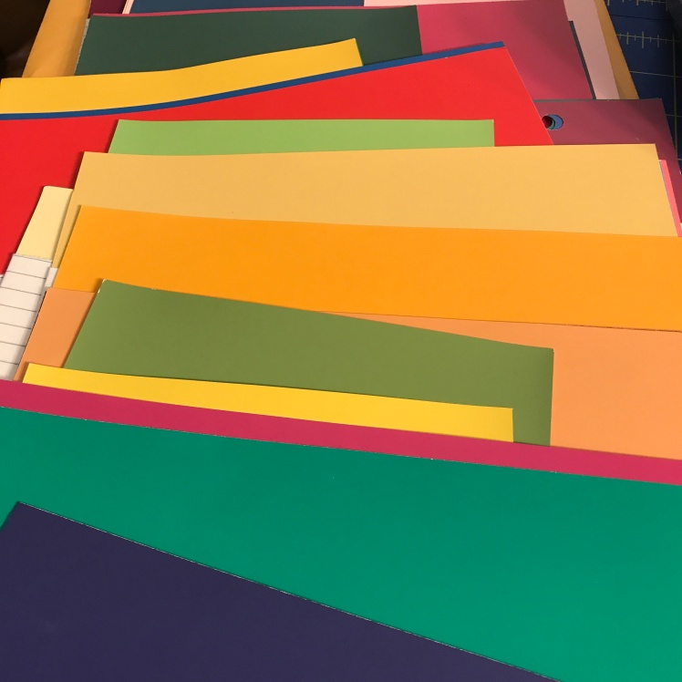
Truth is Beauty details several options for draping, including using color cards, lipstick colors, choosing your best and worst colors, or taking an online quiz. I decided to order the color cards and drape that way. Partly because I thought it would be cheaper than lipstick and more accurate than an online quiz (which I did take, multiple times, resulting in a True Winter or Bright Winter depending on how I thought of myself in pure white), and partly because colors are fun! I ordered the full 12-season set, because, although I’ve been suspecting I’m cool toned (which would make me a summer or winter), I was open to the idea that I could be any season as I’ve had difficulty determining my vein colors over the past few months (sometimes they are definitely blue and sometimes they are not). It’s actually become something of an obsession – every time I step outside I’m staring at my wrists trying to figure out the colors happening there. It was almost to the point of me wanting to grab everyone else’s wrists just to make a comparison. I figured ordering the color cards would be easier, or at least more socially acceptable.
On to the experiment!
After getting my cards I sorted them into season via the instructions. I sorted everything color side down until they were finished, so that the first time I would see the colors would be in their family seasons. The day after my package came, I lucked out and had a perfectly cloudy day, so I sat outside with a mirror, my phone, and the color cards. I pulled my hair back as instructed, and held the colors to my face. I observed in the mirror, but also snapped some selfies to document the results. Here is what happened:
The Springs:


The Summers:


The Autumns:


The Winters:


Firstly, I must comment on how crazily the skin tone changes just by holding up color cards. I took all of these in direct natural light on a cloudy summer day – the perfect case scenario by all accounts. Secondly, I also have to point out that photographs, while helpful, aren’t quite as important as seeing the colors in person. So while I think it is possible I have not identified my best/true/correct season, I’m also pretty sure that there are at least 6-8 other options that are most definitely worse. Finally, I wasn’t having the best skin day, though this might have been helpful in hindsight as it made it easier to see which seasons emphasized blemishes and scars.
So, on to how I made my selection…
Try #1: Eliminate the obviously bad, then compare the leftovers.
Using the method of swiping through my photos and eliminating the photos in which I am most obviously discolored, tired-looking, or oddly blotchy. My first eliminations were True Spring, True Summer, Soft Summer, Soft Autumn, Dark Autumn, and Dark Winter. Interestingly, I was pretty sure heading into this that I would be a cool or dark season, so I was really surprised when half of my top picks were from the warmer seasons, and none from the Dark options. Also interestingly, my top picks were both of the Brights (Spring and Winter), both of the Lights (Spring and Summer), and two true seasons (Autumn and Winter). When I look at my top 6 vs. my bottom 6 seasons, it becomes clear that the most important dimension of color for me is chroma. All of the seasons that made it to my top picks have medium-to-high chroma, whereas all of the rejects are low-to-medium. The warmth was all over the map (True Winter’s primary characteristic is Very Cool, and True Autumn is Very Warm, leading me to think that I’d be in one of the neutral seasons), and the value was light-medium fairly uniformly. This analysis, at the very least, says to me that as long as I stick to more saturated colors, even if they aren’t 100% season correct, will probably be doing a fair bit to help my skin look good. It also indicates that I’m a bit more neutral in my undertone than I suspected – I’ve been thinking it was cool, but I never seem to be able to tell with the vein test (some days they are more purple and other days more green), and the gold/silver test leans silver, but gold has never been truly horrendous. Anyway, after narrowing the field down by half, I compared Light to Light, Bright to Bright, and True to True.
Light Spring v. Light Summer (Light Value and Medium Chroma held constant; A test of Neutral-Warm v. Neutral-Cool):


Bright Spring v. Bright Winter (High Chroma and Medium Value held constant; A test of Neutral-Warm v. Neutral Cool):


True Autumn v. True Winter (Medium Value Constant, Winter has slightly higher chroma, main test is Very Warm v. Very Cool):


I spent quite a bit of time looking in a mirror to make these comparisons. Sometimes the better palette was pretty obvious, but for many of these I had to further do a color-to-color comparison (ie, I’d look at the blue from one palette, then the blue from the other palette and decide which blue was better, then repeat for all the colors). My top 3 after this comparison were Light Spring, True Winter, and Bright Winter.


Finally, I narrowed it down to True Winter or Bright Winter – it was really close! The green from True Winter was much better than the lime green from the Bright Winter, and, surprisingly, the True Winter yellow was not terrible (I’ve never worn yellow – not my favorite color). The dark blue/purple colors were pretty comparable, and the Bright Winter blue is my favorite color from all the swatches I got sent, so I was a bit worried about being too emotionally blinded by that color (though it did look good I think). Which means it came down to the red/pink colors. While the pink from the True Winter was fine (nothing offensive, but not really doing anything for me), the red from the Bright Winter was a color that I should be wearing all day everyday. It is surprisingly lovely against my skin in person. So, somewhat pleasantly surprised, I came to the conclusion that I was a Bright Winter.
Try #2: Choosing the best of each season, using photos only.
Because I’m slightly obsessive when I fixate on things, I spent the evening flipping through the photos on my phone, mostly concerned that my love of the Bright Winter palette may have colored my opinion in making my initial analysis. One of the helpful suggestions that came with the swatches was to quickly toggle between photos and have a gut reaction of good or bad, by fixating on the center of the face and somewhat intuitively registering if the colors were working harmoniously. Flipping through 12 photos got a bit muddled (as the good ones were quite separated), so I thought to pick the best from each season, then compare the final four. Once again, True Winter vs. Bright Winter was the hardest choice.
The Conundrum:


I ultimately settles on the Bright Winter because the skin looks slightly less blotchy and slightly more luminous in the highlighted zones, the cheeks look slightly rosier, and the lips look slightly more intensely colored. Key words for all of this is slightly. Very, very slightly. Using this method for all the other seasons, my top picks were: Light Spring, Light Summer, True Autumn, Bright Winter.


Between these, I found True Autumn to be the worst; the features seem to be a bit too orange and a bit too fuzzy. The colors blend in to the skin, but in a boring way more than in a complimentary way. Third place I would give to Light Summer; that yellow is just too pale and sticks out like an awkwardly sore thumb to the point of being jarring. Second would be Light Spring – the skin is slightly orange, and the colors also fade into the skin. Both the Spring and Autumn palettes have similar effects – likely the result of the palette being too warm. The Summer has the opposite problem, the warmth seems to be ok, but the saturation of the colors isn’t quite there. So, honestly, once Bright Winter got out of it’s own seasonal comparison, it was an easy pick for the top from these options.
Try #3: Ask for the opinion of… a skate mom.
I’d arrived at Bright Winter through two different means, but I was still worried that I’d been swayed by the pretty colors in that palette. So I went to another resource – I asked my mother to look at my swatches. I only showed her the options from my top 6, and she was actually rather liking True Autumn, True Winter, and Bright Winter. As it was late, in the slightly yellowed indoor lighting we were able to narrow it down to True Winter and Bright Winter, with her leaning slightly towards True Winter because of the green and dark blue, and being nearly shocked that there was a yellow that “didn’t look like total $%*^” on me. Convinced that the running was too tight to to decide in crappy lighting, we took it out to the natural light the next morning, where she spent quite a bit of time doing a color-to-color comparison. She liked the dark navy blue over the brighter purple blue, found the bright blue and True Winter green to be nearly equivalent, and didn’t care for either the lime green or yellow on me (though admitted that the green was slightly better), which, again, left it to the reds to determine the color season. The bright red, by her analysis, was completely and easily superior to the True Winter pink.
Feelings over the results:
By three different methods, I arrived at Bright Winter every time, though True Winter is a very close second. If I head down this Bright Winter path and find I don’t like it, I have a pretty good idea what to try next. But I LOVE the colors in Bright Winter, so I really hope it works out for me. And, a few additional data points have me thinking Bright Winter is actually a pretty accurate diagnostic, or at least a good first attempt:
- My skating dance dress (post to come) this season was a bright electric-royal blue paired with a silver fabric. Like, shockingly bright blue, and everyone LOVED it. Pairing it with silver is the sort of cool/bright combo that should work for Bright Winter, and it did. What’s more, I wore it with a bright red lip color and it did not look ridiculous. Granted, performance/costumes are probably not the best way to do color analysis, as there is a certain exaggerated color and style to the garment and makeup, but I think it is somewhat telling that I could wear that much color and still look reasonable.
- Lots of the color analysis sites discuss makeup for Bright Winters, and say that the colors need to be somewhat cool (Winter), but also bright and fun (the Spring influence). They suggest that sparkly eyes and bright lip colors are not too much. I *love* doing a sparkly eye in a neutral shade – I always feel like it makes things pop in a good way, without being too crazy.
- Finally, I’ve been doing something of a makeup overhaul (more to come in another future post), which has included getting a lot of sample lip colors. Surprisingly, while I was searching for a great nude/neutral lip I came to the realization that the darker mauves were too cool, and that the lighter nudes were too orange. I’m finding that the bright, bold red almost looks the most natural on me (weird, right?), whereas the nude, neutral tone looks like it is hovering above my lips in the most odd and awkward fashion.
What’s Next:
So, with three different methods, over several days all arriving at the same conclusion, I’ve decided to embrace the idea of being a Bright Winter. The fun thing is that now I can order a color fan! It’s a bit of an investment, but I figure if I was going to buy paint color cards from the store based on my personal palette, I’d be spending about the same. Between the two palettes, the Bright Winter seems more “me” even though the colors pulled from the other palette came directly from a photo of myself. Interestingly, when I look at the colors pulled from my skin and lips, they tend to be quite a bit brighter (in chroma and value) than the colors pulled from my hair and eyes. A few of them fit quite nicely into the Bright Winter Palette (especially the greens and bright coral pinks), which makes me think that this might be on the right track.

Since the professionally sold fans contain many more colors than the ones pulled from the face photo, I’ve decided to go that route. I could buy a fancy fan from True Color International or Invent Your Image, but I think I’ll be ordering from the Truth is Beauty store again. I know it’s a bunch of paint chips, but I figure I can cut them down, punch holes in them, and make myself a portable fan pretty easily. Plus, I had great service from them when I ordered the draping cards, so there’s that. I’m really excited to get a fan – it seems like it’ll be great for fabric shopping or stash shopping when planning a capsule wardrobe.
Also, I’m hoping that this will help me narrow down and create color palettes using Anuska Reese’s method for mini seasonal capsules. I liked the way she set up her palettes, which I played with before when experimenting with the idea of a capsule wardrobe, but I think now I’ll be able to lay out color cards physically and make better choices for creating a palette.
Also, I wanted to include the following additional resources:
- Signature Style – A resource that sends you newsletters with style ideas. It is important to know your type for this; for example as a Bright Winter/Soft Classic I would subscribe to the Winter-Classic newsletter. Personally, I think I’ll have more fun picking out my own clothing patterns and colors, but I do think this is an interesting service. It might be fun for sewists to subscribe to for more personalized inspiration.
- Another blog post about combining style type with seasonal color.
- The Truth is Beauty Blog, which posts weekly, and their resource page.
- I like this post from the Curvy Sewing Collective about capsule wardrobes. It would be fun to use one of these methods to plan a Bright Winter/Romantic-Classic Capsule – it would also be a great way to see if this combination of style identity and color system works for me as a wardrobe, without having to create too many pieces!
So, all my more experienced sewing peeps out there – have you ever had a seasonal analysis or drape done? I know a few sewing bloggers have posted about it, but I don’t run across it that often. Is it something you would want to try in the future? What do you all think about the “skin only” approach to choosing colors – does it make more sense than lumping everyone with the same hair color in the same category? Do you all think I made the right call in going for Bright Winter, or does another season jump out as being better for me? Discuss!

For you, I’m Team Light Summer all the way 👌🌤
LikeLike
Have you checked out House of Colour? I’ve had an online analysis based on Sci/Art (which was total rubbish) and a Sci/Art and House of Colour analysis that came to the same conclusion, but I found the House of Colour one far superiour.
I waited a long time to have a real analysis because I couldn’t afford it. So the advice I can give to those who for whatever reason try to figure out their season on their own is this: trust your gut feeling. Some times you can get carried away by what you see on other people’s photos, and/or logic gets in the way, for instance, “I couldn’t possibly be X season since my eyes look warm”, or “I couldn’t be X season since I look nothing like all those who have been analysed and *are* X season”. But deep, deep, DEEP down, we ARE attracted to certain colours, and that’s not accidental.
LikeLiked by 1 person
I hadn’t heard of House of Colour – I’ll check it out, thanks!
LikeLike
I’ve got absolutely no advice to give you, but just wanted to say that I am finding your series of posts fascinating and I do appreciate you including the links to tons of resources for further investigation at a later stage. However I am kind of too stubborn to do this because if my favourite colours are not ones I should be wearing I will more than likely ignore the advice and also I would probably want to pick colours from different seasons (i.e. all the purple ones!).
LikeLiked by 1 person
Hahaha… I know what you mean. I think my problem is I love blues and greens, which seem to be quite abundant in most of the palettes I’m looking at, and I really like them all, though I have a special affinity for some of those Bright Winter blues for sure. I feel like I should expand my color horizon a bit as well though. If I’m being totally honest, I don’t think I am going to completely restrict my color choices to those in a specific season for forever (too many pretty colors), but what I would do is decide which elements of color flatter me (I like True Winter and Bright Winter in person, but I’m hearing cries of Light Summer and Light Spring from the crowd, so what do all of these have in common? Medium-high Chroma, light-medium value, and neutral warmth.) If I stick to colors that are very chromatic and not too dark, too cool, or too warm, I’ll probably be ok. Everything might not be “the best” but as long as there is a decent amount of “pretty good” I’m in the right direction. But I’ll still stubbornly buy a beautiful piece of fabric, even if it isn’t totally “my season.”
LikeLike
I love the light spring on you best!!
LikeLike
I’m really enjoying your style and colour posts, thanks! I had my colours done professionally many years ago and still have my fan which works really well for me. I was worried my favourite colours wouldn’t be right for me “scientifically” but it turned out they were perfect (along with a few I hadn’t expected which was fun) so anyone concerned about this shouldn’t be worried as I think we are instinctively attracted to colours that suit us most of the time. Occasionally I still purchase fabrics that aren’t exactly right for me just because I love the colours or patterns anyway but I’m okay with not looking perfect all the time 😉
LikeLiked by 1 person
Thanks! It makes me feel better that I have a reason for loving certain shades of blue and red.
LikeLike
Great post! I was where you were a few years ago and I tried Dressing Your Truth. It took a few tries, but I finally realized I was a T3…It’s MUCH more than a just wardrobe system! I understand people so much better….and look good while doing it!!! I encourage you to give it a try when you’re ready. On my blog, I have posts tagged with DYT where I talk about my experience. Plus, I have a DYT outfits page. My style has evolved and it will continue to evolve…but I have a colors that will allow me to transition into any style. I LOVE it and wish I had discovered it in my teens.
LikeLike
I was a member of Dressing Your Truth (DYT) and I have the book. I am a Type 4 which coincides with the classic Winter season. I also have a rigid, perfectionist personality as described for Type 4 in the book, which was a bit eery to me. The courses were very new age for my taste and expensive. Some of the rules were ridiculous. I watched a Zoom group of ladies post-makeover and I wasn’t impressed by their choices. The author examined their buttons and metal hardware to ensure they were wearing the correct silver or gold for their Type. She praised them for painting over the metals. I got a mental picture of painting silver over the brass on my Louis Vuitton handbag and ruining it. That was too much for me, so I signed off permanently.
With DYT, there is a real risk in envisioning your personality type as “perfect” rather than adapting to your environment. For example, one lady on the DYT blog actually got fired post-makeover. She was a demure redhead, an accountant who wore earthtones. She transformed into a bold striking woman in straight lines and Winter colors reminiscent of the 1980s. She shocked her colleagues and her manager had to confront her. For that reason, I can’t recommend that system.
LikeLiked by 1 person
I also want to comment on House of Color or HoC, as it’s called in the private Facebook group. I don’t have a HoC analyst in my state or any states close by. But I’ve been draped as a Spring by other companies that use the 4-season system they use. I was also in the HoC Spring group on Facebook for awhile. I can give you my impression.
The original 4 seasons work as long as you fit neatly into the palette. If you don’t, you are told to wear the best colors near your face and everything else below the waist. The Spring palette has the hardest neutrals to find in stores. Shopping gets even more difficult as you age and your coloring shifts. You may lighten or cool down to the point that few of those colors work anymore. They must be mixed or worn below the waist. That’s what happened to me. My husband begged me not to wear light warm neutrals and warm pastels anymore. I was left with bright navy only, and that is unacceptable.
I got re-draped in person by a Sci/Art analyst in 2019. I arrived without makeup and she covered my tinted hair. There are 12 seasons to work with, including cool-neutral and warm-neutral palettes that work perfectly for people like me on the cusp of 2 seasons. We found out that I’m neither true cool nor true warm, but very bright. I was delighted because it validated what my instincts were telling me for years, that I wasn’t exactly Spring or Winter but a blend. I now have Winter colors with a dash of Spring to lighten and brighten it. I switched to rose beige foundations and noticed my photos don’t look sallow anymore. What a revelation! I can enjoy the full palette without restrictions.
When I was in the HoC group, members were encouraging each other to style themselves as gamines and ingenues to support the Spring colors they were wearing. I didn’t go for that. I have a curvy Romantic body which needs flowing lines, I and prefer mature styles. A member scolded me for dressing like a sophisticated “Jewel Tone Winter” (a HoC term.) I responded that I believed I was a Bright Spring blended with Winter. They promptly trashed 12 season systems and the moderator kicked me out of the group. I was angry at first. Later, I was relieved not to see a steady stream of rust and orange outfits in my feed anymore. After my Sci/Art draping I joined the Clear Winter and All Things Winter Facebook groups.
The Sci/Art system is *not* rubbish from my experience. My analyst did a style assessment after my initial draping. She analyzed my body lines and personal preferences. We settled on Romantic, which was spot-on. It isn’t prefabricated to say you’re a Winter Dramatic, Spring Gamine, Autumn Bohemian and Summer Romantic. It also doesn’t dictate color choices based on a personality quiz like DYT and others. Sci/Art is very tailored for the individual. Only Sci/Art uses the red test to detect true warm, true cool, or a neutral blend. This makes or breaks some clients.
LikeLiked by 1 person